The Brand
Educational Videos
I designed the PGIL brand identity, which was used for a series of educational videos shared with the NYU community. I provided animation direction and examples to the NYU media team.
Swag Design
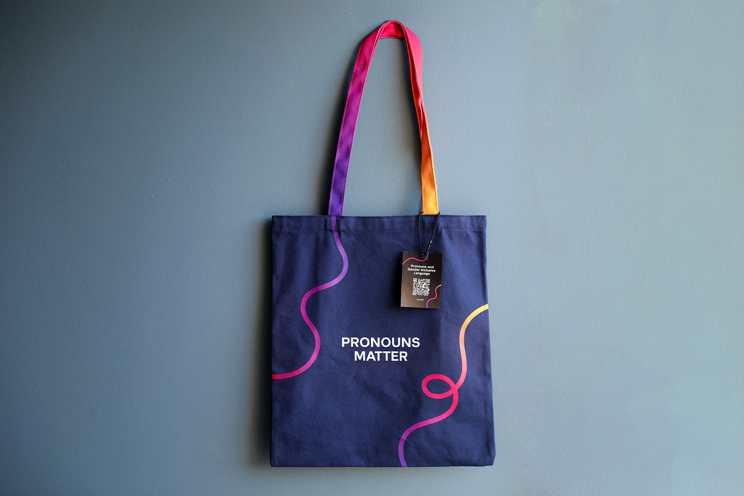
I designed various physical products to increase brand awareness throughout the university, as well as to be handed out during PGIL events such as the launch party. These included tote bags, sticker tags, and business cards with a sticker included.


Digital Promotion & Social Media
I also designed digital assets for promotion through various NYU LGBTQ+ Center channels. These included Instagram layouts, an email press release, and slideshow templates.


Video Series
Watch this space for some GIF excerpts of the finished animations used in the videos. You can find the complete video series here.

Project Brief
The Pronouns and Gender Inclusive Language (PGIL) project began in 2021, when the NYU LGBTQ+ Center noticed a lack within the university of educational resources around pronouns, gender identity, and gender inclusive language. Research found that, in particular, it was faculty, administrators, and staff that had the most questions on these topics.
With this in mind, the Center began work on a series of short videos centered around pronouns and gender inclusive language, aimed at the NYU community as a whole but especially faculty and staff. The goal was to provide easily accessible and digestible information around these topics and promote support of trans and nonbinary people at NYU and beyond. The videos were around 3-6 minutes long and included explanations of pronouns and other helpful terminology, examples of how to use pronouns correctly in everyday life, and testimonies from NYU's trans and nonbinary community members.
An initial brand identity was proposed in 2022 by Mateo Villalba-Rodriguez, but it was met with conflicts from senior leadership. So, when I joined the project, our first step was to decide whether to attempt to redesign the old identity, or create a new one altogether.

Initial Concept
Ultimately, we decided it was best to create a new brand identity. Based on the goals of the project and the feedback given to the original brand, these were the main requirements for the new one:
- Feel inclusive, community-centered, dynamic, interconnected.
- Not using rainbows anywhere in the design — we didn't want to signal that this resource was only for LGBTQ+ people.
- Not using colors that suggest a binary concept of gender, e.g. pink and blue.
- Appear visually connected to NYU, while also being unique and fun.
- Meet the university's accessibility guidelines (eg. high color contrast, gentle animations, etc).

I worked with Mateo (the creator of the original brand) to create some initial concepts. To tie the new identity closer with NYU's general brand, we decided to use NYU's official font, NYU Perstare, and add purple (NYU's main color) into our color palette. We tried to find shapes that felt abstract enough to not be distracting, while also being connected to the themes of the project. For example, in the iterations below, the diagonal lines were a callback to the slashes that are often used to stylize pronouns (eg. "she/her/hers").


Initial concept 1


Initial concept 2
Finally, we landed on the motif of water as a way to represent the fluid nature of gender. Water helped to visualize that gender wasn't simply male or female, but something that could exist in a spectrum and could change over time.
At first we represented this idea through blocky, organic shapes, but soon that turned into curved, flowing lines. Trying different color combinations, we decided these lines should be gradient, to further convey the complex and ever-changing nature of gender. The lines, when animated, could also represent a path forward, a journey of learning and, ultimately, bettering oneself and one's community.


From this...
To this!

The Brand Guide
The PGIL videos would ultimately be rendered by the NYU Media Production team. To ensure the brand identity was consistent and accurate throughout the series, I was tasked with developing a brand guide to share with them.
Here are the key elements of the PGIL brand:
Colors
The background of the videos would be navy blue, and text would always be off-white, to ensure legibility throughout.
The rest of the palette includes a set of analogous colors: pink, yellow, purple, and blue. These colors would be used to create gradients, which serve to highlight the fluid, changing nature of gender.
The color purple also ties back to NYU's university-wide brand identity, which was important in case the videos were shared outside of the university.

Gradients
Here are examples of the gradients that could be made with the color palette. To keep it simple, gradients would have 2-3 colors, and one of these must always be purple to represent the university.
Additionally, we recommended that yellow or orange were included in at least one line in any given frame or layout. This was to avoid using only pink or blue in the gradients, which may suggest an idea of gender binary.

TYPOGRAPHY
The type palette consisted of NYU Perstare Bold for title text, and NYU Perstare Regular for body text. To ensure legibility, text would generally be in title or sentence case, rather than all caps.

LINES
The gradient lines of PGIL are the main decorative element, representing the fluid nature of gender and the journey of learning about gender inclusive language.
These lines are curved, smooth, and free-flowing, but not too busy. The thickness of the line stroke may vary, but the width should generally stay consistent throughout the length of the line. Loops may be added for aesthetic purposes, but never on graphics with heavier text content to avoid being distracting.


